07 July, 2022 | News
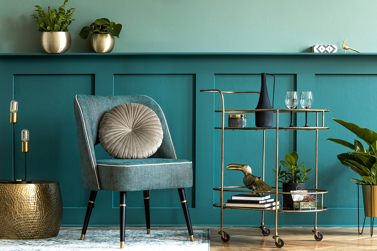
Choosing colors, along with being an important aesthetic choice based on a preference for one shade or another, can also be a way to skillfully play with the characteristics of a room, such as its size or exposure, or even its purpose and intended use.
Let’s start by exploring the effect of color on the size of a room. The basic concept is this: light colored walls generally have the tendency to enlarge a space, creating an opening and widening effect, while dark colored walls tend to create a more enclosed space, making it appear less open and more gathered.
Knowing the “optical effect” that colors can have is an important factor to choosing colors consciously and knowledgably, allowing you to consider various combinations to obtain the result you like best and to make the most of the room that you are designing.
Let’s take a look at a few examples of color combinations:
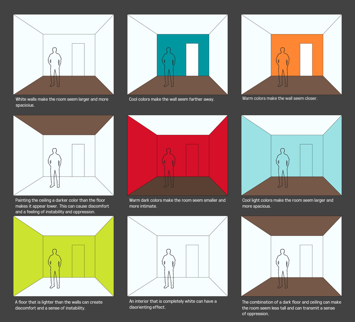
Let’s take a look at a few of the above scenarios. In the first image, we can see how painting the walls white can make the room feel larger and more spacious. Or, if we choose to paint the far wall a different color, it can have varying effects: if it’s a cool color, the wall will appear farther away, while a warm color will make it appear closer. Using a dark or warm color on all the walls of the room will make the room feel smaller, more enclosed, and intimate, while choosing a softer color for the walls, such as a light pastel shade, we’ll create the effect of a more spacious and larger room.
It’s important to be aware of these “optical effects” to avoid making a choice that gives an undesired effect for the space that we are designing.
Another important factor to take into consideration is the natural brightness of a room and its exposure to natural light. And don’t forget that the quality of natural light isn’t always constant, it varies throughout the day and over the course of the year, and these changes will influence the perception of the color that we choose for the walls of our room.
Let’s take a close look at the exposure of our room, considering each case if our room faces north, south, east, or west.
In rooms that face the north, the natural light coming into the room will always tend towards cooler tones, meaning that it is best to avoid colors that have cool undertones, tending towards green or gray. We can opt for colors with warm tones, in lighter shades, to attract as much light as possible. Alternatively, we could choose slightly darker shades, still sticking with warmer tones, to create a more enveloping atmosphere that gives a greater feeling of comfort.
For rooms that face the south, on the other hand, there are no problems with light, since the light that comes in from our windows will have a warm tone throughout all hours of the day, making our palette choice simpler. Here, we have the possibility to play with light pastel tones, to take advantage of the amount of natural light, making the room even brighter.
If we have to choose a color for walls in a room that faces east or west, it’s best to think of the intended use of the room. For these exposures, we have to consider that facing east will result in warm strong sunlight in the morning and a less intense, cooler light in the afternoon hours, while facing west will have the opposite effect.
Of course, along with natural light, we have to consider the artificial light sources in the room, and choose the type of illumination that best matches the warm or cool effect that we want to obtain. Halogen and incandescent lights emit a yellow light and will make the colors of our room appear warmer, while cool lights will make corresponding cool colors stand out even more.
The size of our room and its exposure and brightness are important considerations to take into account before we start exploring our own personal design tastes, as they can have a decisive effect on the outcome of our interior design project and an outsized influence on the final look and feel of our room.
At this point, we can consider the other things that are already present in the room, or that we’d like to have in our room, meaning the furniture, the décor, the flooring, and so on. With these in mind, it’s important that we pick our dominant, main color, which will allow us to coordinate the remaining parts of our room.
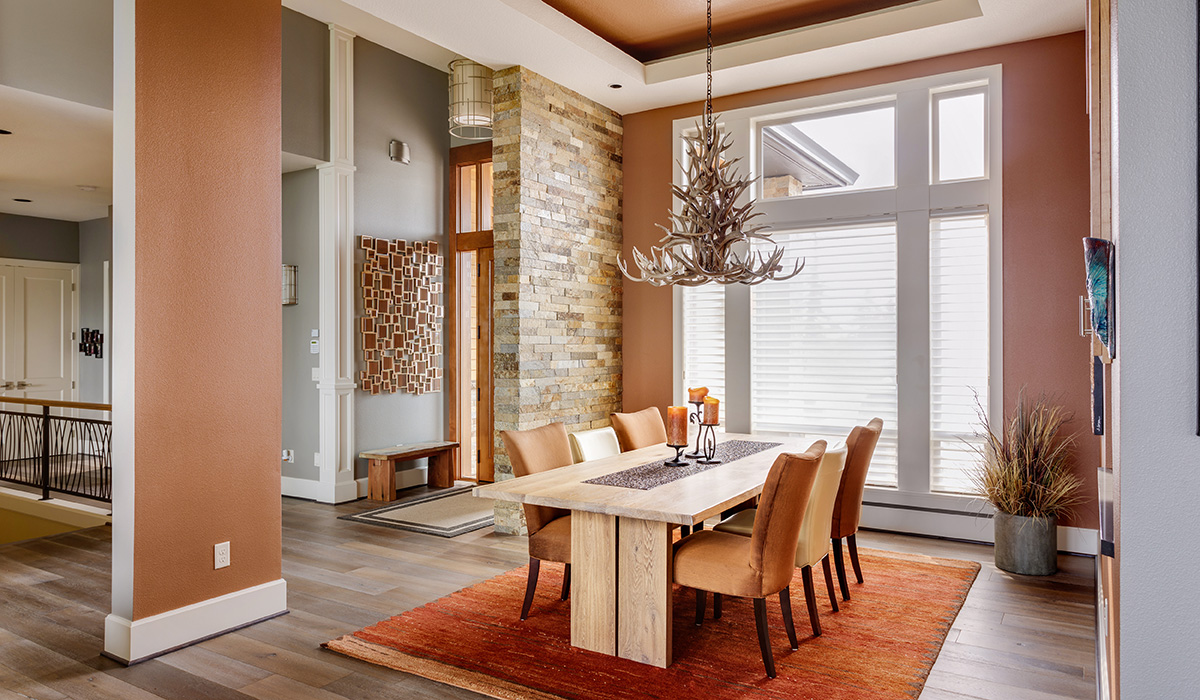
An example that we often see is to pick a strong color for the walls, and then coordinate the door and window frames with more neutral colors. This allows you to easily give an elegant appearance to the room. If there is boiserie or wainscot, you can choose to highlight them by using a different color for them than for the walls. We can even play with colors that create a particular optical effect, for example, choosing a darker color for our paneling and leaving our walls and ceiling a lighter color, which will create an illusion of a higher ceiling in the room. Or, we could choose the same light tone for the paneling and the ceiling, while giving the walls a more decisive and intense color.
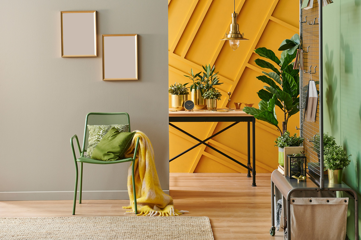
Lastly, let’s not forget to create color accents with décor and accessories. This allows us to give a more dynamic and joyful appearance to even the most serious and formal spaces, and can be achieved by choosing throw pillows, decorative pieces, paintings, and more.
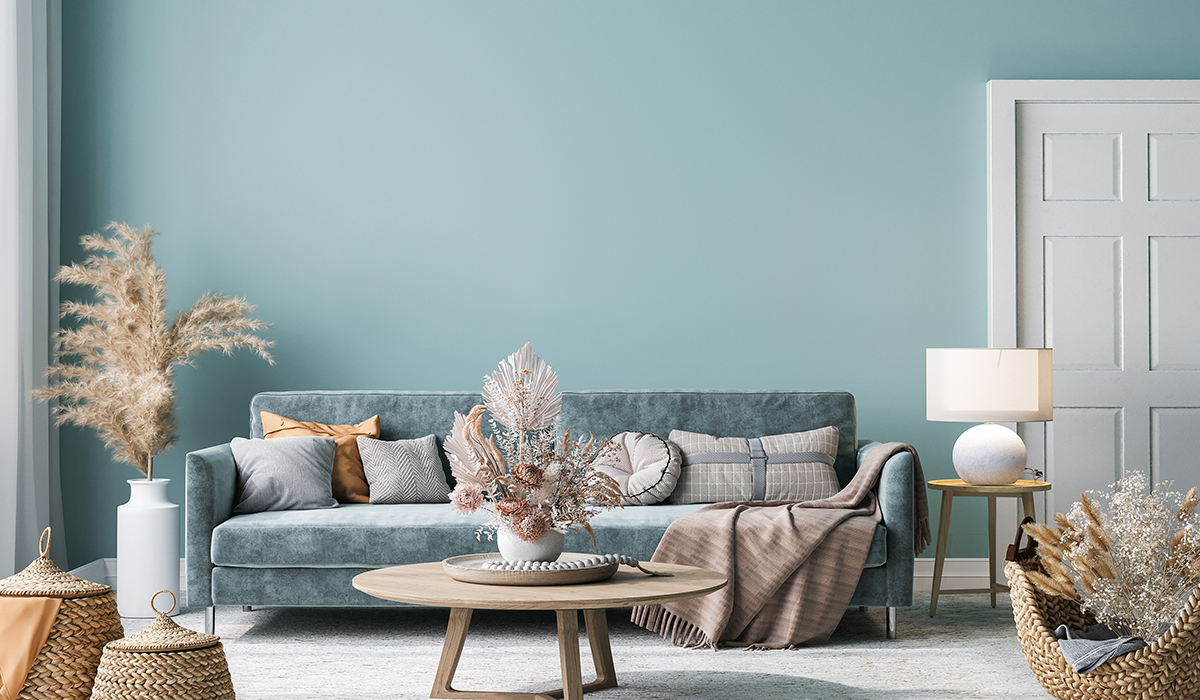
Matching colors in an optimal manner shouldn’t ever be taken for granted, and it’s important here to again start with the basics. For example, choosing tone-on-tone is always a valid solution. Without risking much, tone-on-tone lets us play with various shades to create a lively interior with a coherent and consistent color choice.
We can also opt for complimentary colors that allow us to create an eye-catching effect with tons of personality; this choice is perfect for rooms that are playful and lively. Our advice is to remain within a triad of colors and use their various shades to avoid risking a final effect that is chaotic and disorderly.
.
In this brief article, we’ve seen, as usual, that the choices for color are endless and vary greatly, but that it is important to know your space well in order to obtain the best result.
Which solution to you prefer? Do you use lots of different colors in your design projects or do you stick with a few favorites? Let us know by tagging us on social media so we can all share and be inspired by new designs!
See you next time and happy designing to all!
To receive more information about our products, request a free consultation, or activate a subscription, please contact us.